Comic book culture has exploded into the mainstream, with blockbuster movies and hit TV shows dominating the entertainment landscape. But while we celebrate the iconic heroes and villains, the intricate plots, and the stunning artwork, there’s a crucial element of the comic book experience that often goes unnoticed: the lettering. It’s the unsung hero of the comic book page, the silent guide that directs your eye, conveys emotion, and brings the dialogue to life. But have you ever stopped to think about where that iconic “comic book font” came from? The answer is a fascinating journey through the history of art, technology, and design.
From the early days of hand-drawn lettering to the digital precision of modern typography, the evolution of comic book lettering is a story of innovation and adaptation. It’s a craft that has been shaped by the limitations of printing technology, the creative vision of legendary artists, and the ever-changing tastes of readers. So, let’s pull back the curtain and explore the amazing world of comic book lettering, from its humble beginnings to its high-tech future.
The Golden Age: The Birth of a Craft
In the Golden Age of comics (1938-1956), lettering was a purely manual craft. Early comic books were seen as a disposable medium, and the lettering reflected that. It was often crude, inconsistent, and done by the artists themselves. However, as the popularity of comics grew, so did the need for specialized letterers. Pioneers like Ira Schnapp at DC Comics and Artie Simek at Marvel Comics helped to establish a consistent and readable style that would define the look of comics for decades to come. [1]
During this era, lettering was done directly on the original artwork using a crowquill pen and India ink. Letterers had to be incredibly precise, as there was no room for error. They used lettering guides like the Ames Guide to maintain consistent letter heights and spacing. The goal was to create lettering that was clear, easy to read, and didn’t distract from the artwork. As Todd Klein, a legendary letterer, explains on his blog, the process was painstaking and required a steady hand and a keen eye for detail.
“Like most things, comics lettering has evolved from its earliest iterations, a process which some bemoan and others embrace. Not only has the physical process of creating the lettering changed, so has the look of it, and the tools used to create it.” – Todd Klein [1]
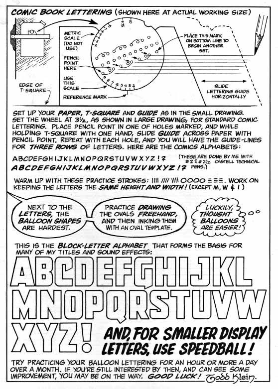 Caption: A comprehensive guide showing traditional hand lettering techniques and alphabet styles used in classic comic books. Credit: Todd Klein Source: Todd Klein’s Blog
The Silver Age: The Rise of the House Style
The Silver Age of comics (1956-1970) saw the medium mature, with more complex stories and sophisticated artwork. The lettering also became more refined, with a greater emphasis on style and consistency. This was the era of the “house style,” where each publisher had its own distinctive lettering look. DC’s lettering, largely defined by Ira Schnapp, was clean, elegant, and classic. Marvel’s lettering, on the other hand, was more dynamic and expressive, thanks to the work of letterers like Artie Simek and Sam Rosen. [1]
This was also the era when the tools of the trade became more standardized. The Ames Guide and the crowquill pen were still the primary tools, but letterers also began to use templates for speech balloons and sound effects. The goal was to create a polished and professional look that would appeal to a growing readership. For more on the evolution of comics, check out our article on the future of comics.
The Bronze and Dark Ages: A Time of Transition
The Bronze Age (1970-1985) and the subsequent Dark Age (1985-1996) were a time of great change in the comics industry. Stories became darker and more complex, and the artwork became more experimental. The lettering also began to evolve, with more variation in style and a greater emphasis on conveying emotion. Letterers like Gaspar Saladino became known for their dynamic and expressive work, pushing the boundaries of what was possible with hand lettering. [1]
However, the winds of change were blowing. The rise of personal computers in the 1980s and 1990s would soon revolutionize the way comics were made. The painstaking process of hand lettering was about to be replaced by a new and powerful tool: the digital font.
The Digital Revolution: The Rise of Comic Book Fonts
The advent of digital technology in the 1990s transformed the comic book industry, and lettering was no exception. The once-manual craft of hand lettering was replaced by digital fonts, a move that was met with both excitement and trepidation. Companies like Comicraft, founded by Richard Starkings and John Roshell, were at the forefront of this revolution, creating digital fonts that replicated the look and feel of classic hand lettering while offering a new level of flexibility and efficiency. [3]
As Nate Piekos of Blambot explains, the switch to digital lettering was a game-changer. It allowed for easier corrections, faster production times, and a greater variety of styles. However, it also required a new set of skills. Letterers now had to be proficient in graphic design software like Adobe Illustrator and Photoshop. They had to understand the principles of typography and design to create lettering that was not only readable but also visually appealing. [2]
“Since well-executed lettering is an often overlooked part of the comics reading experience, very few people realize just how much graphic design skill is required to do the job well.” – Nate Piekos [2]
 Caption: Modern digital lettering techniques showing the evolution from hand-drawn to computer-generated typography. Credit: Todd Klein Source: Todd Klein’s Blog
The Modern Era: The Best of Both Worlds
Today, comic book lettering is a hybrid of art and technology. While the vast majority of comics are lettered digitally, there is still a deep appreciation for the craft of hand lettering. Some artists and publishers still prefer the organic and personal touch of hand-drawn letters, while others embrace the flexibility and efficiency of digital fonts. The result is a diverse and vibrant landscape of comic book lettering styles.
Modern letterers have an incredible array of tools at their disposal, from custom fonts and digital brushes to sophisticated software that can create complex sound effects and intricate balloon shapes. They can draw inspiration from the entire history of comic book lettering, from the classic styles of the Golden Age to the experimental work of the underground comix movement. For a deeper dive into the history of speech bubbles, check out this excellent article from Smashing Magazine.
The Future of Comic Book Lettering
So, what does the future hold for comic book lettering? As technology continues to evolve, so will the tools and techniques of the trade. We may see more interactive and animated lettering in digital comics, or new fonts that can adapt to different reading devices. However, one thing is certain: the art of comic book lettering will continue to be an essential part of the storytelling process.
From the humble beginnings of hand-drawn letters to the cutting-edge technology of digital typography, the evolution of comic book lettering is a testament to the creativity and ingenuity of the artists who have dedicated their lives to this unsung art form. The next time you read a comic, take a moment to appreciate the lettering. It’s more than just words on a page; it’s a vital part of the magic of comics.
Resources
The Art and History of Lettering Comics – https://kleinletters.com/Blog/the-art-and-history-of-lettering-comics/
The Essential Guide to Comic Book Lettering – https://blambot.com/pages/the-essential-guide-to-comic-book-lettering
Where the “comic book font” came from – https://www.vox.com/2016/9/2/12760504/where-the-comic-book-font-came-from
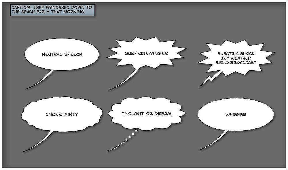 Caption: Historical evolution of comic book speech bubbles and dialogue presentation techniques. Credit: Selfie Comic Hero Source: Selfie Comic Hero
For more on the visual storytelling in comics, check out our article on the impact of social media on comics.
")
")
")
")
")
")


")